How to Use the ‘F-Shaped Pattern’ to Increase Engagement and Conversions
Contents
Reading online is different than perusing a book or magazine. Internet users are accustomed to quickly scanning information, only stopping on the parts that are most important to them. Eye tracking studies have even shown that online readers often scan web pages in predictable patterns.
This is important for you as a website owner or developer, because understanding how users view your site can help you improve its design. By knowing where a visitor’s gaze is naturally going to fall first, you can better position those design elements you want to prioritize, such as your Calls to Action (CTAs).
In this post, we’ll explain how and why people tend to read web pages in an F-shaped pattern. We’ll also discuss why this is important, and talk about how you can use this technique to improve your site’s content. Let’s get started!
An Introduction to the F-Shaped Pattern
The term ‘F-shaped pattern’ describes the way people’s eyes tend to move over a web page when they read content online. Most visitors will start at the top of a page, reading the headline first.
Then they’ll move their attention down the left side of the page, looking for stand-out elements such as numerals or bullet points. Finally, their eyes will move horizontally across the page again to read bold text or subheadings.
Once a reader has found the bulk of the information they want, they may continue to scan the page quickly, stopping if anything catches their eye. This all happens in a matter of seconds, as you can see on the heat maps below:
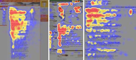
This eye-tracking study from the Nielson Group outlines the general shape of our gaze as we scan a web page. The hot spots (in red, orange, and yellow) show where most users’ eyes lingered the longest. The resulting pattern often resembles a rough “F”.
This pattern creates a visual hierarchy:
- Brand marks and navigation are usually the first things to be viewed.
- Within content, images receive the most attention, with headlines coming in a close second.
- Text is scanned and not thoroughly read.
Take a look at this landing page for the Boston Globe, for example:
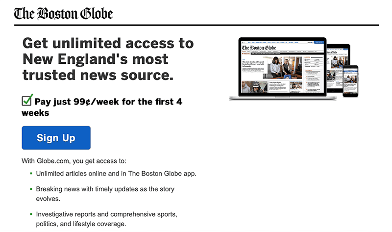
When you look at this page, your eyes likely scan the headline, jump to the image, and then scan down to focus on important elements such as the CTA button and bulleted feature list. This is the F-shaped pattern in action.
Why the F-Shaped Pattern Is Important
When designing your website’s pages, it’s a good idea to consider the intentional flow of your layout. After all, you want users to be able to find information on your site as smoothly and as easily as possible.
Understanding the F-shaped pattern can help with this. If your content doesn’t match up to this general pattern, users may waste time trying to find what they want. A negative user experience can lead to lost engagement and fewer conversions.
On the other hand, following the F-shaped pattern when designing your pages will help to make navigation more intuitive. A simple and expected design flow can improve visitors’ experience on your site significantly.
How to Use the F-Shaped Pattern to Increase Engagement and Conversions (3 Key Tips)
Now that you have an idea of where the F-shaped pattern comes from, let’s take a look at some of the ways you can use this design strategy to your advantage.
1. Put the Most Important Elements First
Since you know that most readers will begin at the top of the page, you may want to put your most important elements there. What you choose to feature in this space will depend on the focus of your website, but some things to consider include:
- Company logos
- Images
- Important headlines
- Products or services
- Mission statements
A lot of sites choose to put their products or services across the top of their pages, since that’s what is most important to their audience. This ensures that visitors immediately see what the site has to offer:
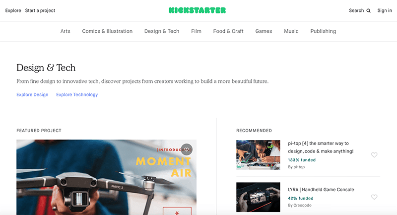
For instance, Kickstarter starts its pages off with a simple headline, followed by a catchy subheading designed to pique interest. That subheading also acts as a kind of mission statement.
Whatever you choose to feature at the top of your pages, it needs to be simple enough to convey its message in a few seconds. Otherwise, visitors may lose interest or continue to scan the page without knowing what’s important. This is your chance to offer them something they will remember.
2. Create a Clear Visual Hierarchy
By keeping the F-shaped pattern in mind as you design your pages, you can guide users towards a better understanding of your content. A clear design helps users easily see what your site has to offer at a glance.
Once a user lands on your page, laying out its various elements following the F-pattern helps them intuitively understand how it’s structured. What’s more, you can create a visual hierarchy by positioning elements on the page in a way that reflects their relative importance.
Some of the most successful websites use a layout that looks something like this:
- Top left: A company logo that draws the eye to the top of the page, and reminds users of your brand.
- Top right: Contact information, such as a phone number or email address, so users know exactly how they can get in touch with you.
- General content: Frequent headlines followed by text along the left side of the page.
This makes navigating your content intuitive for visitors:
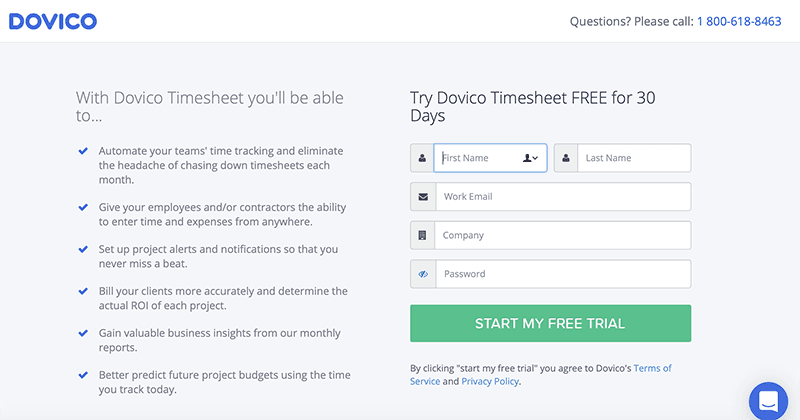
For example, this Dovico landing page puts the company name in the top-right corner, and key contact information in the top left. That way, these are some of the first elements you’ll notice, and you can easily reference them as needed.
From there, the page includes two columns of content, with the text placed to the left. Notice, however, that your eye is ultimately drawn to the CTA button, which is placed on the bottom line of the “F” in the visual hierarchy.
3. Generate Engagement Using Your Sidebar
Your site’s sidebar provides a crucial opportunity for generating engagement and keeping readers around longer. If you want to maximize its effectiveness, the F-shaped pattern suggests that the traditional left-hand vertical sidebar is your best bet.
This type of sidebar can contextualize your content for visitors, and directs them towards other parts of your site that they may be interested in. Some elements to consider for your sidebar include:
- Ads
- Social pages
- Links to related articles
- Freebies
- Newsletter signups
BuzzFeed, for example, uses its sidebar to display both ads and additional content. As an entertainment site, ads are important for generating revenue, but engagement is the number-one goal:
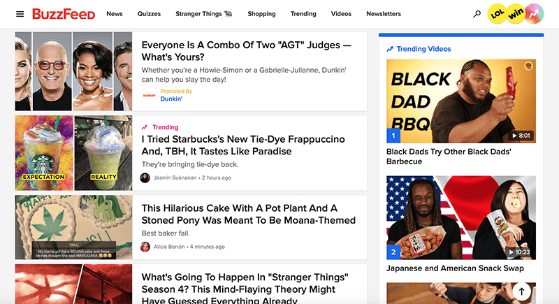
As your eyes are scanning down the content on this page, they may be drawn to one of the articles in the sidebar that is more interesting to you. By including something similar on your own site, you’ll have a greater chance of engaging users for longer.
Conclusion
The bottom line is that understanding how visitors view your online content can help you build a better website. By using the F-shaped pattern as a guideline, you’ll be able to create pages that convert visitors and increase engagement.
As we’ve seen, three key tips for taking advantage of the F-shaped pattern in your site’s design include:
- Put the most important elements first.
- Create a clear visual hierarchy.
- Generate engagement using your sidebar.
Do you have any questions about the F-shaped pattern and how to use it effectively? Ask away in the comments section below!
About John Hughes
John is a blogging addict, WordPress fanatic, and staff writer.